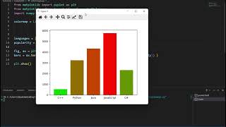
Matplotlib’s color engine has evolved from a static collection of named hues to a sophisticated system that supports perceptual colormaps, custom palettes, and dynamic normalization. For data‑driven researchers who need reproducible visual fidelity, mastering these tools means selecting the right color space, understanding trade‑offs between visual accessibility and aesthetic impact, and applying realistic expectations about performance and portability.
What makes color handling in Matplotlib a nuanced skill?
At first glance, Matplotlib appears to offer a simple color='red' argument, but beneath that façade lies a layered architecture:
- Color specifications: named colors, hex strings, RGB tuples, and CSS4 keywords.
- Colormap objects: sequential, diverging, and qualitative maps that map scalar values to RGBA.
- Normalization classes:
Normalize,LogNorm, andPowerNormthat control how data values are translated into colormap indices.
These components interact with Matplotlib’s backend rendering pipeline, which can switch between vector (PDF, SVG) and raster (PNG) output. Choosing the appropriate combination determines not only visual clarity but also file size and cross‑platform consistency.
Which built‑in color systems provide the most flexibility?
Matplotlib ships with three primary families of colormaps, each optimized for a different analytical purpose:
- Sequential colormaps such as viridis*, *plasma*, and *cividis* are perceptually uniform, ensuring that equal data steps appear as equal visual steps—a critical factor for accurate interpretation.
- Diverging colormaps like coolwarm* and *RdBu* highlight a central neutral point, making them ideal for datasets that pivot around a baseline (e.g., temperature anomalies).
- Qualitative colormaps such as tab10* and *Set3* assign distinct hues without implying order, perfect for categorical comparisons.
Beyond the defaults, the matplotlib.colors module allows researchers to define bespoke palettes using the LinearSegmentedColormap or ListedColormap classes. Incorporating external libraries—seaborn for statistical palettes or cmocean for oceanographic schemes—extends the palette repertoire without sacrificing reproducibility.
How do trade‑offs between perceptual uniformity and aesthetic appeal influence choices?
Balancing scientific rigor with visual storytelling often forces a compromise. Consider the following practical points:
- Accessibility: Uniform colormaps reduce the risk of misleading gradients for color‑blind viewers, yet they may appear less vibrant than legacy palettes like jet*. Testing with tools such as
colorblindrcan quantify the impact. - Print vs. screen: Colors that look distinct on an sRGB monitor may compress into similar shades when printed on CMYK paper. Selecting palettes with high contrast in both spaces mitigates this issue.
- Performance: Generating large raster images from high‑resolution colormaps can increase rendering time. Simpler discrete palettes often load faster, especially in interactive notebooks.
These considerations suggest that the “best” colormap is context‑dependent; the insider secret is to prototype with multiple options and evaluate them against the specific audience and medium.
What realistic expectations should researchers set when customizing palettes?
Custom colormaps are powerful, but they come with constraints:
- Complex gradients may not translate faithfully across backends, leading to subtle hue shifts in PDF exports.
- Embedding a custom colormap in a shared library (e.g., a PyPI package) requires careful version control; downstream users must import the same map definition to reproduce figures.
- Dynamic normalization (e.g.,
LogNorm) can amplify noise in low‑signal regions, so analysts should pair custom palettes with data cleaning steps.
By acknowledging these limits early, researchers avoid costly re‑work and can plan for reproducible dissemination of their visualizations.
What are the immediate next steps for applying these insider tips?
Implementing the discussed strategies can be broken into a short, actionable checklist:
- Audit existing plots for color‑blind safety using
colorblindror a manual simulation. - Replace any legacy jet or similar colormaps with perceptually uniform alternatives (viridis*, *cividis*, or domain‑specific palettes).
- When a custom palette is required, define it with
LinearSegmentedColormap.from_listand register it viampl.pyplot.register_cmapfor reuse. - Select an appropriate
Normalizesubclass to align data scaling with the chosen colormap. - Export a test figure in both raster (PNG) and vector (PDF) formats to verify color consistency across media.
Adopting these practices positions researchers to convey their data with precision, accessibility, and visual impact—fulfilling the promise of unlocking insider secrets to mastering color in Matplotlib.
группа Аспиды - Курортный сезон (1993) — Видео от радио Забытая кассета

группа Аспиды - Курортный сезон (1993) — Видео от радио Забытая кассета ...
Спорим с Ищенко. Что будет с российским оружием в Турции? | Радио

Спорим с Ищенко. Что будет с российским оружием в Турции? | Радио ...
Дмитрий Пучков. ООН признал преступления ВСУ и критика "Одиссеи" Нолана

Дмитрий Пучков. ООН признал преступления ВСУ и критика "Одиссеи" Нолана ...
Тотальный беспредел, или Когда сменится власть в Киеве | Николай Азаров

Тотальный беспредел, или Когда сменится власть в Киеве | Николай Азаров ...
Хазин и Пучков. Чем запомнится ЧМ – 2026 по футболу? | Радио Sputnik

Хазин и Пучков. Чем запомнится ЧМ – 2026 по футболу? | Радио Sputnik ...