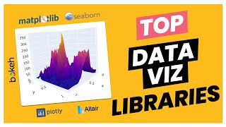
Matplotlib’s extensive color system—named colors, sequential and diverging palettes, and full‑RGB customization—lets analysts turn raw data into graphics that attract attention and convey insight. By selecting the appropriate color option, you improve readability, meet accessibility standards, and align visual output with corporate branding, all without sacrificing performance.
Understanding the impact of color
Color is the quickest visual cue for pattern recognition. A well‑chosen palette highlights trends, isolates outliers, and guides the viewer’s eye through the story your data tells. Conversely, a mismatched or overly saturated scheme can obscure meaning, cause misinterpretation, or alienate users who rely on color‑blind‑friendly designs. In practice, the right color choice reduces the time needed for stakeholders to grasp key metrics, directly supporting a value‑focused buying decision.
Built‑in palette families
Matplotlib ships with three core families of colormaps:
- Sequential – Gradual light‑to‑dark transitions (e.g., viridis, plasma) ideal for ordered data such as temperature or revenue growth.
- Diverging – Balanced palettes that pivot around a neutral midpoint (e.g., coolwarm, PiYG) suited for data with a natural zero or critical threshold.
- Qualitative – Distinct hues without implied order (e.g., tab10, Set3) best for categorical variables like product categories or survey responses.
Each family has a default “good‑enough” option, but many alternatives exist that address perceptual uniformity, print‑friendliness, and modern design trends.
Matching palettes to data characteristics
When deciding between options, consider three practical dimensions:
- Data type – Use sequential maps for monotonic trends, diverging for signed values, and qualitative for unordered groups.
- Dynamic range – Wide ranges benefit from perceptually uniform maps like viridis, which maintain distinguishable steps even when compressed.
- Contextual cues – Warm hues (reds, oranges) naturally suggest increase or risk, while cool hues (blues, greens) imply stability or reduction.
Applying these criteria eliminates guesswork and aligns visual output with the decision‑making process of a value‑focused buyer.
Custom palettes for brand consistency
Enterprises often need to embed brand colors into dashboards. Matplotlib accepts custom color lists, dictionaries, or the LinearSegmentedColormap class to recreate brand palettes while preserving gradient smoothness. A common workflow:
- Extract the brand’s hex values (e.g.,
#004080,#A0C0E0). - Create a
ListedColormapfor categorical plots or aLinearSegmentedColormapfor gradients. - Register the new map with
plt.register_cmap(name='brand_seq')and call it viacmap='brand_seq'in the plot.
This approach ensures every chart reflects corporate identity without compromising visual fidelity.
Performance and accessibility best practices
Large datasets can strain rendering if a colormap forces excessive overplotting. Opt for low‑resolution maps (plt.cm.get_cmap('viridis', 256)) and avoid unnecessary alpha blending. For accessibility, test against the WCAG 2.1 contrast ratios using tools like colorcet or the colorspacious library. Choosing a color‑blind‑safe map—such as the viridis or cividis families—prevents exclusion of up to 8 % of the population.
Getting started: sample code snippet
The following minimal example demonstrates a diverging map tailored for profit‑loss data, combined with a custom sequential palette for a secondary axis:
import matplotlib.pyplot as plt
import numpy as np

# Sample data
x = np.arange(0, 12, 0.5)
y = np.sin(x) * 20

# Diverging colormap for the line
cmap_div = plt.get_cmap('coolwarm')
norm = plt.Normalize(vmin=-20, vmax=20)
colors = cmap_div(norm(y))

fig, ax = plt.subplots()
for i in range(len(x)-1):
    ax.plot(x[i:i+2], y[i:i+2], color=colors[i], linewidth=2)

# Custom sequential colormap for background shading
cmap_seq = plt.LinearSegmentedColormap.from_list(
    'brand_seq', ['#004080', '#A0C0E0'])
ax.set_facecolor(cmap_seq(0.2))

ax.set_title('Profit‑Loss Trend with Brand‑Aligned Background')
plt.show()
Running this script produces a chart that instantly differentiates positive and negative values, respects brand hues, and remains legible on both screens and printed reports.
Implications for decision makers
Choosing the right Matplotlib color option is more than an aesthetic choice; it directly influences the speed and accuracy of data‑driven decisions. By leveraging built‑in palettes, customizing brand colors, and adhering to accessibility guidelines, analysts deliver visualizations that convince stakeholders, justify investments, and reinforce strategic narratives. In an environment where every visual cue can sway a purchase or a policy, mastering Matplotlib’s color toolkit becomes a competitive advantage.
Pôster Bergerac - Pôster 1 No 1 - AdoroCinema

Pôster Bergerac - Pôster 1 no 1 - AdoroCinema
Bergerac Season 1 - Watch Full Episodes Streaming Online

Bergerac Season 1 - watch full episodes streaming online
Cyrano De Bergerac By Citadel Theatre - Issuu

Cyrano de Bergerac by Citadel Theatre - Issuu
Bergerac (TV Series 2025- ) - Posters — The Movie Database (TMDB)

Bergerac (TV Series 2025- ) - Posters — The Movie Database (TMDB)
Bergerac Season 1 - Watch Full Episodes Streaming Online

Bergerac Season 1 - watch full episodes streaming online